Project with Poieśis Journal, Brazil


Leporello Book
Creation Myths - Book One - The Metamorphoses
Chaos


Chaos is always the starting point


Creation Myths - Book Two - The Universe is a Simulation


Creation Myths - Book Three - Genesis


Binary, simplistic and brutal


From the Collection: Works by Michael St. John
I have a small collection of art acquired through trades with artists and from generous gifts from friends. This post features the work of Michael St. John, an artist and friend, who I have known for 30+ years. Michael has a protean practice that focuses on the state of the world where he presents a challenging amalgam of work that references art history, culture, both high and low, politics and the general malaise of life in the late 20th and early 21st century. Michael has shown widely, both nationally and internationally and has worked with some of the most discerning dealers in New York, including Hudson at Feature Inc., Andrea Rosen, Jośe Freire at Team Gallery, Marveli, Karma et. Al. It is not an exaggeration to say that Michael has a cult following and continues to provoke strong reactions from viewers. Michael’s approach to painting is largely conceptual, which he complicates by using ideas and images that can be confrontational and explicit. What is often overlooked in his work is the high level of skill and mastery found in his paintings, drawings and sculpture.
The work here is primarily from the 1990’s.

In this painting a Richard Hamilton button bears down on a languishing and decadent Werner Fassbinder who is positioned underneath a farting Aubrey Beardsley illustration that stands atop the blurry head of Martha Steward while sporting a TCIF smiley face on its back. The images are non-hierarchical, disregarding their broader cultural context while making them share the same space. The painting is from the late 90’s and is 72 inches square and offers a marvelous cacophony of the high, the low and a bit in-between. When this painting was shown in the ‘Ball and a Bat’ exhibition in the Feldman Gallery at the Pacific Northwest College of Art in Portland Oregon a person left a note that said she was outraged that a painting this "disgusting” would be shown in a public space especially where children might see it. She ended the note by saying that she would never enter the gallery again. I found it perplexing to try and imagine what meaning she constructed that made this painting so offensive. The exhibition ‘A Ball and a Bat’, was curated by Michael and myself and included Mary Weatherford, Glenn Goldberg et. Al.

This painting is from an interesting series that Michael produced in the 90’s that utilized references from mass culture that were purposely not current at the time, which oddly made them relevant in the paintings. They included cartoon figures and more obscure images from a series of Big Daddy Roth’s Hot Rods and the Monsters who drove them. Each painting was made up of multiple canvases of different thicknesses that were painted as one continuous flat surface then reconstructed to acknowledge the different depths of each panel. In this painting the two end pieces are the same depth while the middle panel has a shallower profile. The painting comes together to make a deceptive triptych that disrupts the historic narrative of the continuous surface traditionally used to create a painting.
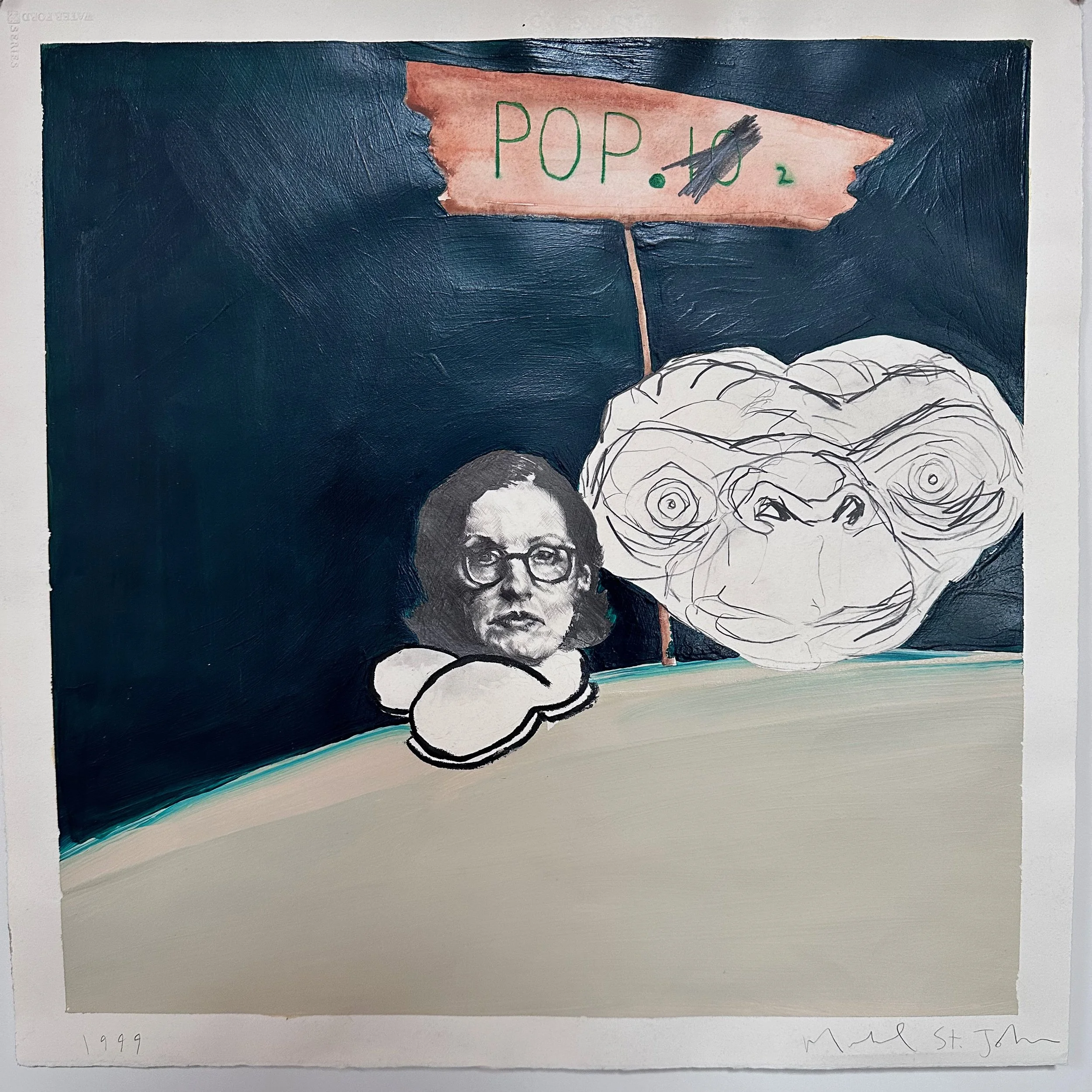
Two disembodied heads skimming the curvature of earth, seemingly unaware that they are floating in space as they look at the viewer challenging them to make sense of their predicament. The smaller head on the left is of Roberta Smith, the senior art critic for the New York Times who is sporting a pair of ‘Mutt & Jeff’ shoes, while the larger one of is of ET who is her companion in this world of two. Both are icons who culturally speak to different audiences, one high the other popular. This is a small oil & graphite work on paper that is 16 inches square and is an excellent example of Michael’s understated virtuosity.

I first saw this painting in the early 2000’s and it offers a look into Michael’s process of collecting images and how he uses their attendant histories to feed the expansive range of ideas he is engaged in. It is also one of the only paintings of his that I make an appearance, in this case top center.
This 1995 painting is titled ‘Grassy Knoll’, which succinctly reduces the complexity around the history and conspiracies of JFK’s assassination to the equivalent of a very effective GIF. This painting has a funny currency since a band of ‘Q’ followers have descended on Dallas where they wait near Daily Plaza and the Grassy Knoll for the return of JFK Jr. In my mind this shows that the fictive nature of painting is never as fanciful as life.

This is a masterful drawing. I love that the upper panel of paper is completely blank, which for me is a nod to the idea that art always starts with nothing.

In this work I like how Michaels lets the object represent itself by using the envelope as the vehicle for making the print. This seemingly democratic effort produces an image that captures the abject nature of the holiday that began as a way to honor the martyred saint of love to its evolution as an opportunity for commerce. Whenever I see this piece it reminds me of the “Oh Honey”feeling you get when you see a wayward greeting card abandoned on a NYC street that at one point was a gesture of affection and connection.
And finally this small painting on paper from 50 years ago that shows Michael was an exploding talent even as a youngster.
Clown Calendar
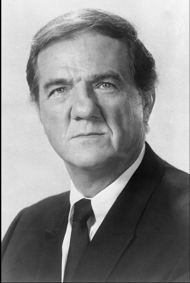
In 2004 Rob Storr curated Site Santa Fe’s Biennial titled ‘Disparities and Deformations: Our Grotesques’. During the course of the Biennial I saw the picture below of Rob Storr taken by Guy Cross, the publisher of ‘The Magazine” that accompanied an interview he gave. The photograph of Storr was a full bleed made all the more beautiful as the publication was printed on newsprint. When I first saw this image, I thought how much Rob Storr reminded me of the actor Karl Malden, and though a bit idiosyncratic, I always thought that Malden had the look of a sad clown.
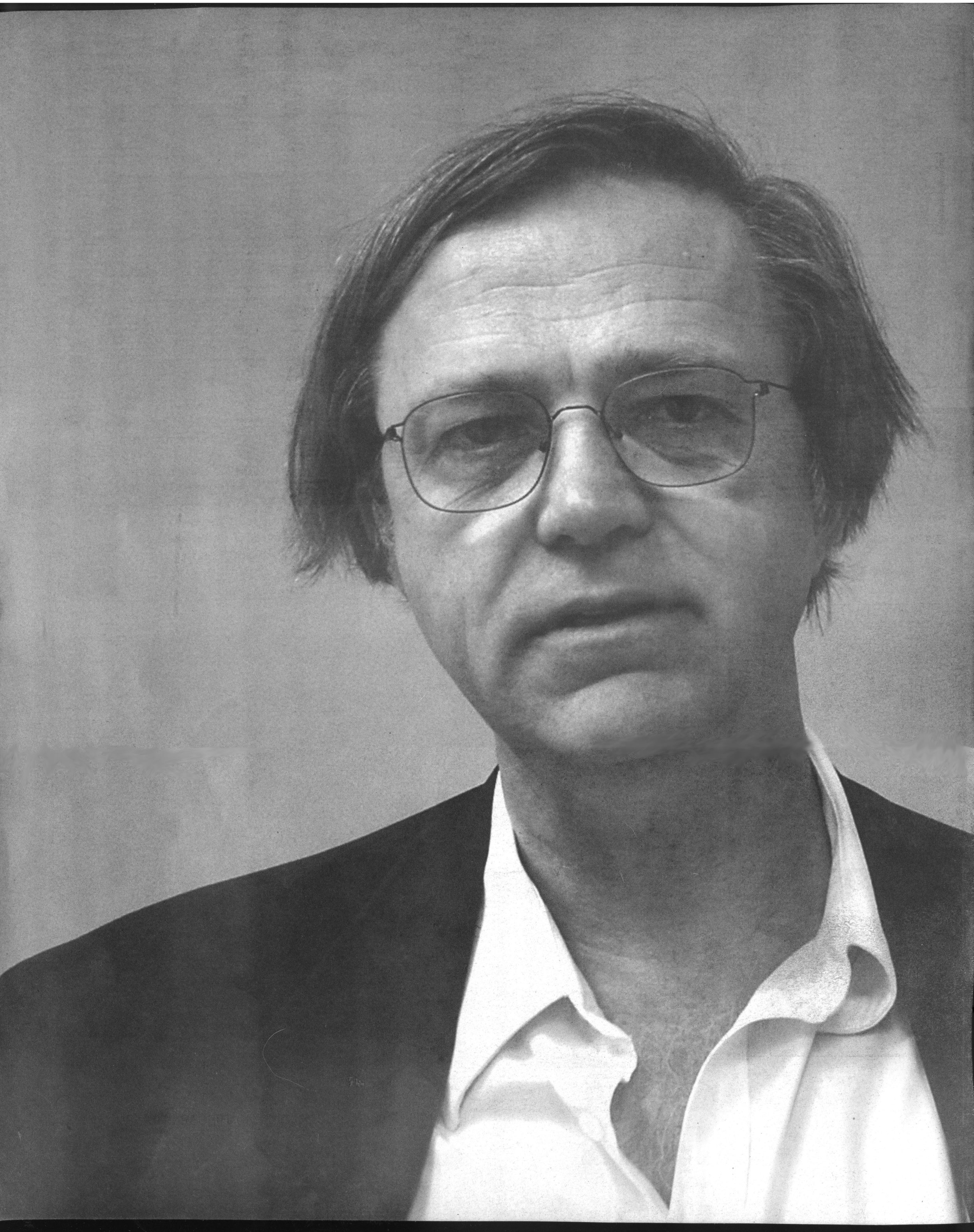

Back in my studio I found myself drawing on the photo to see, first if I could renovate the image of Storr into that of a clown and second if I could transform the photograph into a drawing. The fact that the image was printed on newsprint allowed me to erase ink while the soft graphite perfectly matched the gray scale of the photograph. When I finished I was surprised to see that the photographic image continued to assert itself in spite of how vigorously I had manipulated the surface.
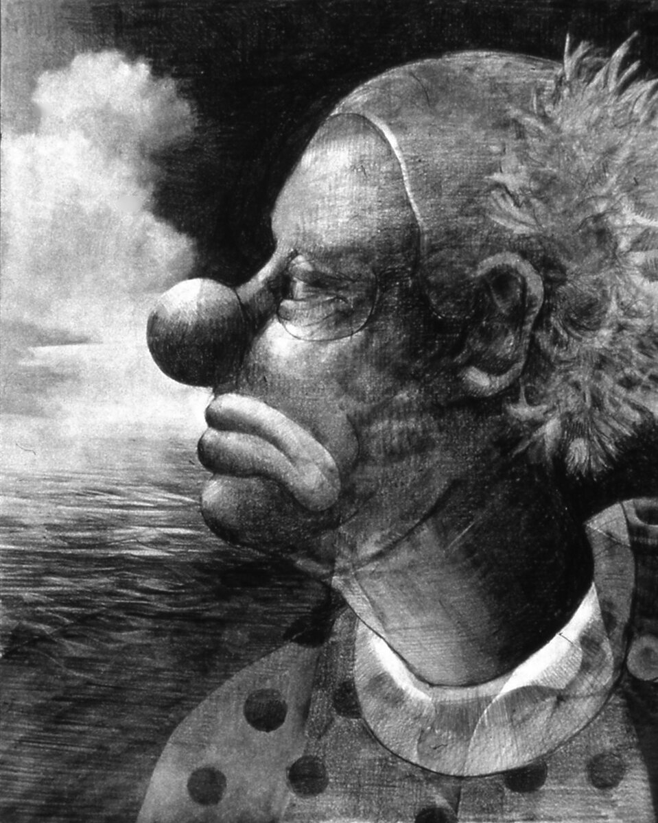
This led me to wonder if I could completely negate the printed image. So, I took another copy of the photograph to do a variation of Rauschenberg trying to erase a DeKooning, but in this case I wanted to see if I could obliterate the photograph by using graphite and an eraser. I made 12 separate drawings over the Storr photograph that eventually became ‘Clown Calendar’*. In each of the 12 attempts, regardless of the effort I made to eradicate the image, I was unable to remove all traces of the photograph. The printed image of Storr continued to retain its power, which lingered like a ghost behind the image of the Clown.

The effort to reorient the photograph of Storr into a Clown drawing revealed what should have been evident at the beginning – that the printed process and photography itself, is too much of a hegemonic medium to be displaced by the hand or the tradition of drawing.
I started to follow Storr after I saw his first MoMA show, ‘Dislocations’, which was wonderful and at the time somewhat unique for its focus on installations. Highlights of the show included a large piece by Louise Bourgeois that I found funny in how she situated a very large phallic cylinder that had a piston moving in and out in a dramatically lit room that felt a bit theatrical leaving the viewer to wonder if it was a sexual reference or just a reminder of how big patriarchy is. The show included an amazing David Hammon installation as well Adrian Piper, Bruce Nauman, et. Al.
I had the opportunity to hear Storr talk about his exhibition, ‘Dislocations’, for a student group at NYU in the early 90’s. Storr’s passion was obvious during his talk which even flared up a bit when one of my students questioned the effectiveness of Chris Burden’s “Other Vietnam Memorial” in relation to his overall body of work. Storr’s response was sharp where he provided the context of the how the piece was a major statement against the war in Vietnam and was also a counterpoint to Maya Lin’s Vietnam Memorial. He explained how important it was to protest against US involvement in the war for artists during the late 1960’s and 70’s.
An older artist/faculty member I knew who was in the audience actually shouted “who does he think he is” after the student made the statement. Later this older artist was taken aback when I told him that the student’s mother was the curator of contemporary art at a major museum who had put together an exhibition of Burden’s work. I suggested that since the student was actually very familiar with Chris Burden that his comment came from experience and evaluation and was not simply naive. But I was struck by the generational response by the older artist to the student’s statement. For the student the war was a historical reference and in his view Burden’s “Other Vietnam Memorial” was a bit didactic and less complex than his other work. For the older artist, who had protested bitterly against the war, his outburst seem to suggest that his lived experience should carry more weight than the student’s assessment.
I apologize to anyone who suffers from coulrophobia.
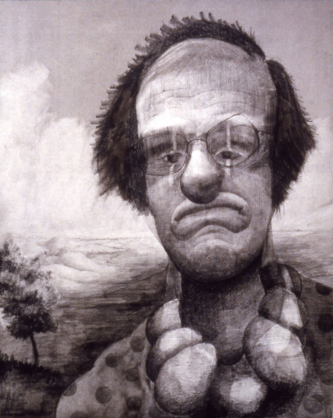
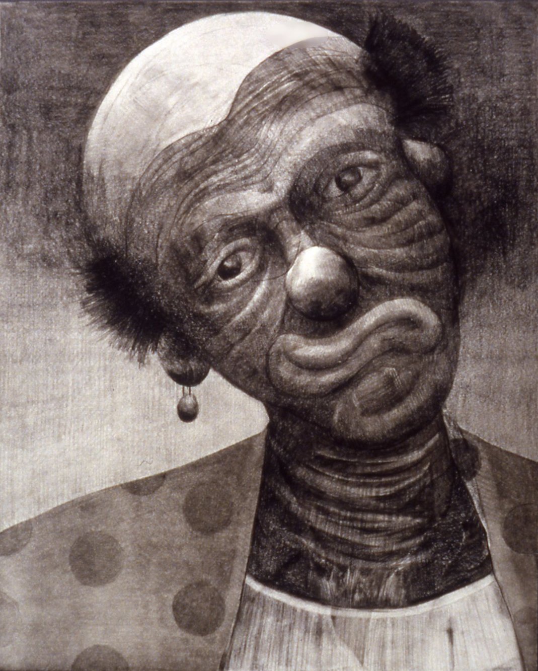
Clown Calendar: May & September
graphite over photograph
2004
Collection of Crystal Bridges Museum of American Art